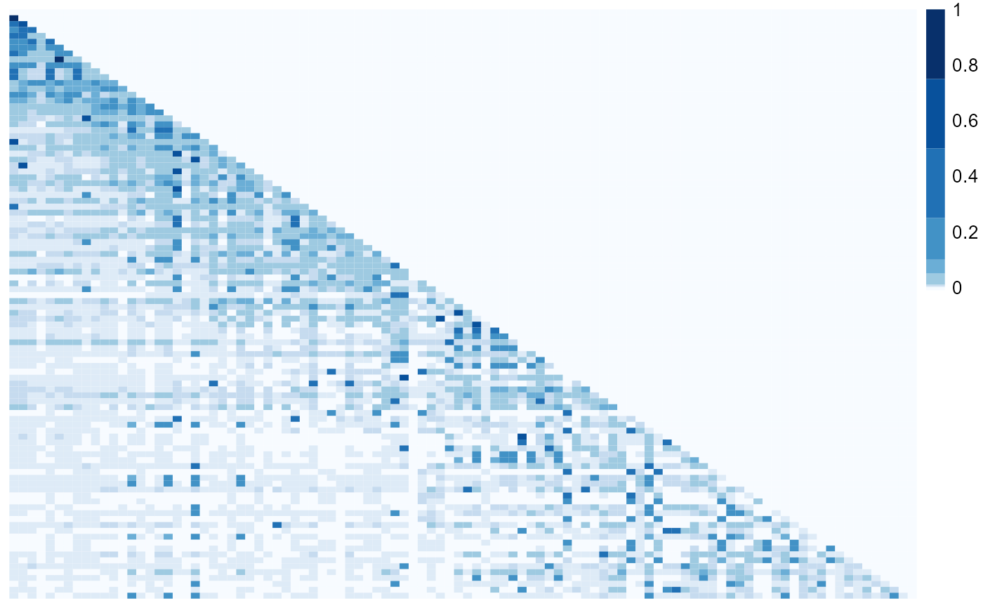
Plots a heatmap of the relative transmission probabilities
Source:R/visualizeResults.R
nbHeatmap.RdThe function nbHeatmap plots a heatmap of the transmission probabilities.
The rows are the possible infectors and the columns are the possible infectees both
ordered by <dateVar>. The darker the square the higher the probability that
the pair represented by that square is a transmission link. If a cluster method is specified
using clustMethod and cutoff, then stars will be drawn in the squares of the
infectors in the top cluster.
Arguments
- df
The name of the dateset with transmission probabilities (column
pVar), individual IDs (columns<indIDVar>.1and<indIDVar>.2), and the dates of observation (columns<dateVar>.1and<dateVar>.2).- indIDVar
The name (in quotes) of the individual ID columns (data frame
dfmust have variables called<indIDVar>.1and<indIDVar>.2).- dateVar
The name (in quotes) of the columns with the dates that the individuals are observed (data frame
dfmust have variables called<dateVar>.1and<dateVar>.2).- pVar
The name (in quotes) of the column with transmission probabilities.
- clustMethod
The method used to cluster the infectors; one of
"none", "n", "kd", "hc_absolute", "hc_relative"where"none"or not specifying a value means use all pairs with no clustering (seeclusterInfectorsfor detials on clustering methods).- cutoff
The cutoff for clustering (see
clusterInfectors).- blackAndWhite
A logical. If
TRUE, then the squares are colored in greyscale, ifFALSE, then the squares are colored with shades of blue.- probBreaks
A numeric vector containing between 3 and 10 elements specifying the boundaries used to classify the probabilities and color the squares. The first element should be less than 0 and the last should be 1.
Details
Users have the option of specifying how the probabilities should be grouped into different
color shades through the argument probBreaks. The probabilities are split into groups by
using probBreaks as the breaks argument in cut with the default options.
The length of the vector should be between 3 and 10 and the first element should be less than 0 and
the last 1 so that all probabilities are guarenteed to be classified.
The colors are defined with the code brewer.pal(length(probBreaks) - 1, "Blues")
(where "Blues" is replaced by "Greys" if blackAndWhite is set to TRUE).
NOTE: This plot will take long to run and may not look good with larger outbreaks (>200 individuals)
See also
Examples
# \donttest{
## Heatmap with no clustering in color with the default probability breaks
par(mar = c(0, 0, 1, 0))
nbHeatmap(nbResults, indIDVar = "individualID", dateVar = "infectionDate",
pVar = "pScaled", clustMethod = "none")

dev.off()
#> null device
#>           1


## Adding stars for the top cluster, in black and white, changing the probability breaks
par(mar = c(0, 0, 1, 0))
nbHeatmap(nbResults, indIDVar = "individualID", dateVar = "infectionDate",
          pVar = "pScaled", clustMethod = "hc_absolute", cutoff = 0.05,
          blackAndWhite = TRUE, probBreaks = c(-0.01, 0.01, 0.1, 0.25, 0.5, 1))
dev.off()
#> null device
#>           1
# }
dev.off()
#> null device
#> 1
## Adding stars for the top cluster, in black and white, changing the probability breaks
par(mar = c(0, 0, 1, 0))
nbHeatmap(nbResults, indIDVar = "individualID", dateVar = "infectionDate",
pVar = "pScaled", clustMethod = "hc_absolute", cutoff = 0.05,
blackAndWhite = TRUE, probBreaks = c(-0.01, 0.01, 0.1, 0.25, 0.5, 1))
dev.off()
#> null device
#> 1
# }